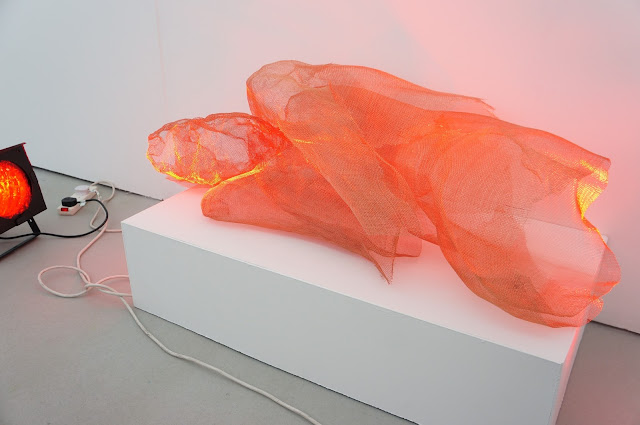
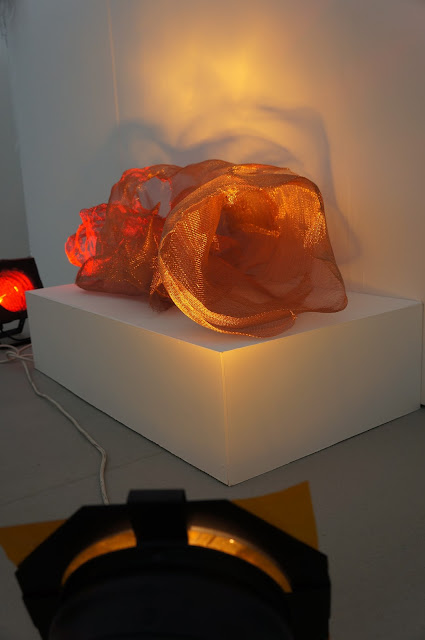
The copper wire mesh became the best option because of the support it gave to the structure. After making the head and part of the neck and shoulders of the body, I ran out of wire mesh and ordered some more which took a couple of weeks to arrive. I was able to photograph the life model and work from the photographs at home. The photographs I had taken were of the life model lying down on her side at different angles. The head had enough support but as I progressed into larger parts of the body, I started to lose the support. I asked my 3-d tutor for some advise - she suggested trying to manipulate the body more like I did to the head because it would compact the wire together. I struggled and started to think I was too ambitious because of the size. I placed my sculpture in different parts of the exhibition space and found that placing it onto a plinth against a wall gave the sculpture support.
The spot lights made the sculpture glow, so I decided to leave the sculpture and considered it finished when lit because I didn't feel like I needed to make a perfect figure. I experimented with differnt coloured filters to see what gave the effect I felt the sculpture needed. I preferred the red filters because the sculpture didn't need any multicoloured lighting, I wanted to keep the sculpture simple. The red filters made the sculpture look bold, muscular and whole. Using different coloured filters separated the body which I didn't want.
The head looks elongated because I left the gap at the top of the head open. I left it like this during making my sculpture so that I would be able to reach inside to mold the body. I have left it open now because it balances with the hole at the other side of the figure.
My friend said the sculpture looks like a tunnel from this angle. I like how the limps on my sculpture mould into the body form and don't separate. Me and my friend also discussed the problem of knowing when to stop. I think I tend to over-work things sometimes but I think I stopped at the right time.
I like the blue light on the face of the sculpture but I it wasn't powerful enough to cover the sculpture.
Me and my tutors had the idea of placing the sculpture on the life model mattress because it would show progression from the life drawing classes. However I felt that placing the sculpture on the mattress made the sculpture look smaller and dull so we removed the mattress. I think the plinth looked better because of the balance of straight edges against the organic form.
We talked about where we could put the sculpture in the gallery space and decided that a space of its own would be the best option so it wouldn't be a distraction underneath the framed work.


No comments:
Post a Comment